

Alright, picture this: you’re back from a long day, Cheetos in hand, sitting at your desk. You’ve gathered all your form submissions, but now you’re staring at a sea of numbers that feels never-ending. Overwhelming, right? But hey, not anymore! Enter PlatoForms’ Generate Submission Reports feature, here to save the day. In just a few clicks, those daunting numbers transform into eye-catching, easy-to-understand charts.
Ready to turn that pile of numbers into something actually useful? Buckle up—we’re diving in!
Data Overload? Not Anymore. Enter Charts.
So, let’s say you just ran a feedback survey for your recent product launch. You got, what, 500 submissions? (Go you!) But staring at each individual response is not gonna cut it. This is where Charts come to the rescue. Instead of wading through all those rows, you can instantly create a visual breakdown of responses.
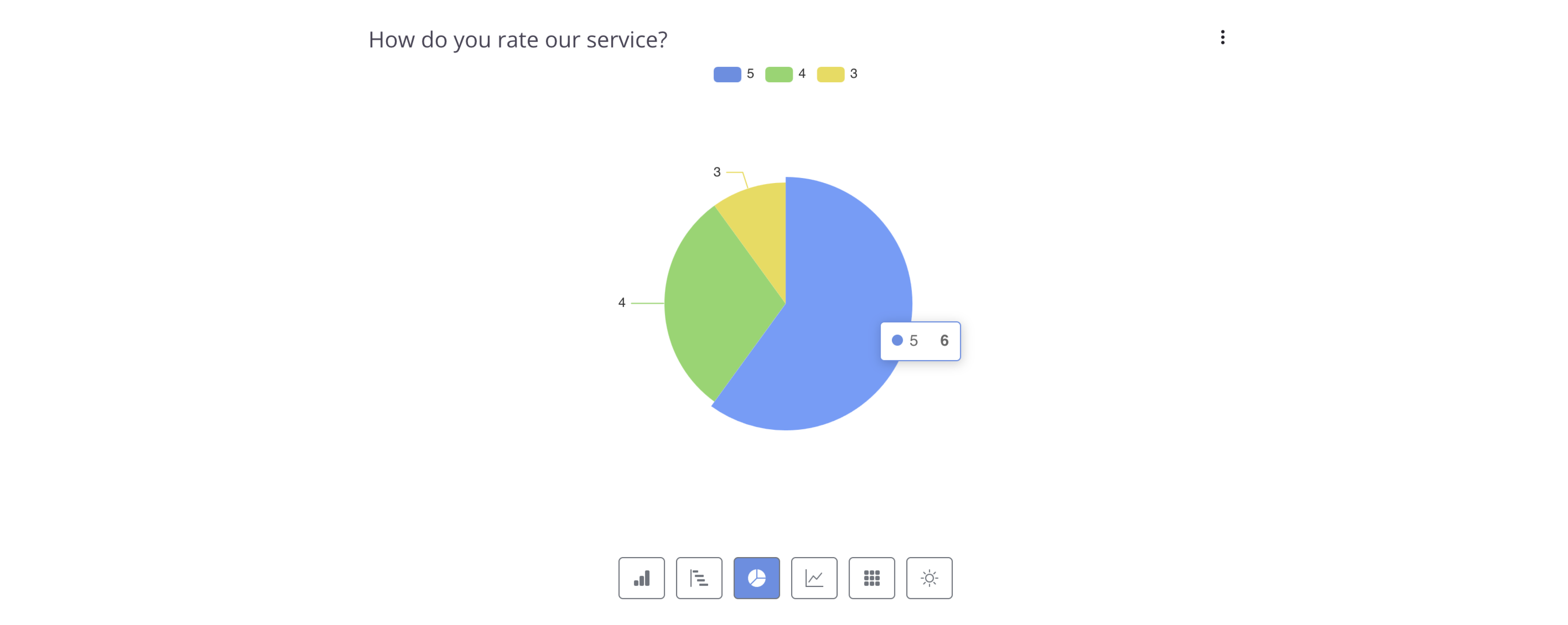
For instance, 72% of your customers said your product was “Amazing,” 20% went with “Good,” and 8% said “Needs Work.” Instead of feeling like you’re reading a never-ending Excel sheet, you can pop this into a Pie Chart. Boom—decision-making made easy!
Why Charts Matter for Data-Driven Decisions
Still on the fence about visualizing your form data? Consider this: 90% of the information processed by the brain is visual. On top of that, studies show that data visualization can speed up decision-making by 28% and help people grasp complex data up to 80% better.
So, why not give your form submissions the glow-up they deserve? By integrating charts into your workflow, you can easily break down complex data and discover actionable insights that lead to better decision-making and results.
Pick Your Flavor: Six Chart Types to Play With
Whether you’re the bar chart kind of person or a treemap fanatic (no judgment), PlatoForms has got your back. You can display your data however you want, with options like:
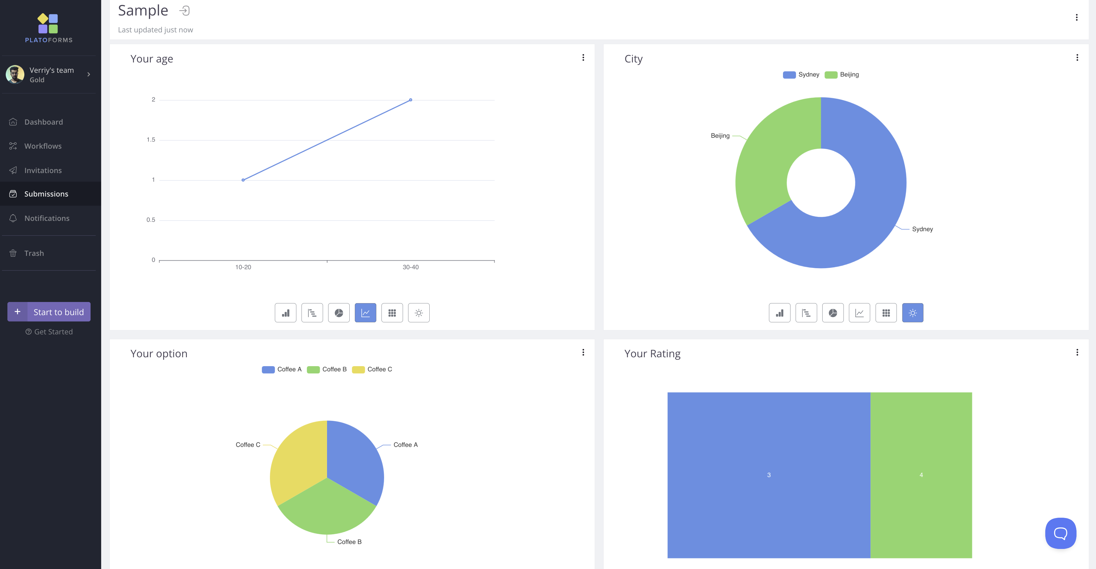
- Column: Got sales numbers across regions? Show off the comparisons.
- Bar: Employee satisfaction by department? Easy peasy.
- Pie: Perfect for breaking down percentages, like the customer satisfaction survey example.
- Line: Tracking a trend, like your email sign-up growth over the past six months? This is your jam.
- Treemap: Visually see how resources are distributed across projects.
- Doughnut: Why not display service preferences with a doughnut chart? Who doesn’t love doughnuts (even if they’re just virtual)?
Take this real-life example: your team is tracking customer sign-ups during a marketing campaign. Using a Line Chart, you notice a 40% spike in sign-ups on Day 7. What happened? That’s when your automated Reminder feature kicked in, prompting users to complete their forms.
The chart not only gives you a clear visual of your success but also highlights how timely reminders boost engagement. By pairing PlatoForms’ Reminder feature with chart insights, you can make sure no submission falls through the cracks, leading to more consistent results.
Your Data, Your Way
Don’t you just hate it when a tool won’t let you customize things? Not with PlatoForms, friend. We’ve always been all about customization—whether it’s switching up form colors, adding your logo, tweaking styles with CSS, or even creating shareable themes for your team.
And when it comes to charts, we’ve got you covered too! PlatoForms lets you tweak your charts however you like:

- Switch between chart types: Maybe that bar chart wasn’t cutting it, switch to a line chart and see if it makes more sense.
- Rename your charts: No more “Field 1” nonsense. Label it “Customer Satisfaction” or whatever floats your boat.
- Adjust the chart width: Make that graph BIG if it’s the star of your report.
- Pick your colors: Make it pretty! Use your brand colors to keep things on-brand (or just pick colors that make you happy).
For more details, see our user guide - Generate submission reports.
PlatoForms keeps the customization options flowing, from the forms you build to the reports you generate. Imagine this: you’re prepping a quarterly report, using custom colors, clearly labeled charts, and matching everything to your brand. The result? A professional-looking report that feels tailored just for your team, and no one has to know how easy it was to create!
Need More Charts? No Problem.
Your data’s always changing, right? Maybe you started with one chart, but later you realize you need another one to break down user demographics. No biggie. Just pop in a new chart. It’s like adding an extra topping on your pizza—easy, and it makes everything better.
Here is the video tutorial for how to use the Charts feature to visualize and analyze your submission data.
For more information, check out the user guide — Generate submission reports.
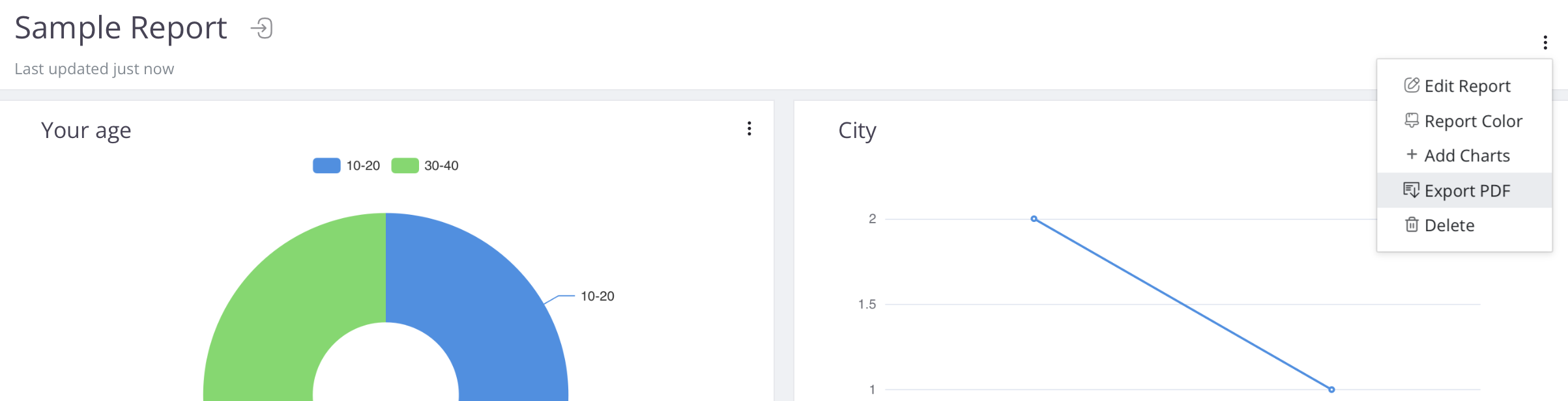
PDF Export: Because Sharing is Caring

Once your charts are perfect (and they will be), you’re just one click away from sharing them. Export your entire report as a PDF and send it off to your boss, your client, or your mom (hey, moms like charts too).
Maybe you’re in healthcare and need to generate HIPAA-compliant reports from patient feedback. Or, maybe you’re in sales, and your boss is breathing down your neck for those Q4 results. Either way, hit Export as PDF and you’re good to go.
Real-World Scenarios: Where This Feature Shines
Still wondering if this is for you? Spoiler alert: it is. Let’s see how it fits different industries:
- Education: Track student progress across subjects with Column Charts.
- Sales: See your conversion rates rise and fall over time with Line Charts.
- Healthcare: Gather patient feedback and visualize it in Pie Charts to see what’s working (and what’s not).
- HR: Keep tabs on employee satisfaction over multiple departments with Bar Charts.
Maybe you’re managing a lead-gen form, and you want to see where the bulk of your leads are coming from—Facebook, Instagram, LinkedIn? A quick Treemap will tell you exactly that.
Next-Level Data Visualization

No worries if PlatoForms’ built-in charts don’t quite hit the mark for you—there’s still a way to get those insights you need. Thanks to integrations with third-party tools like Make, Integrately, and Zapier, you can send your submission data over to platforms like Google Sheets, Tableau, or other BI tools for some next-level data visualization. So even if our charts don’t cover all your bases, you’ve got plenty of options to turn those numbers into something actionable.
For more details, read our integration guide.
Ready to Turn Data Into Insights?
PlatoForms’ Generate Submission Reports feature isn’t just about making your life easier (though it absolutely does). It’s about transforming raw, hard-to-read data into something you can actually do something with.
Got questions? Or maybe you just want to show off your new charts? Slide into our inbox at support@platoforms.com. And for more useful tutorials, follow us on YouTube, and check out our LinkedIn for tips and trends!
If you’ve come up with more creative uses for the chart features and want to share with other PlatoFormers, we’d love to hear from you! And if you have any suggestions for improvements, don’t hesitate to reach out: support@platoforms.com.


